


Apple’s Liquid Glass: Smooth, Sexy, and Slightly Unreadable
Ah, Apple. The Picasso of product design. The Beyoncé of bezels. The Elon of aesthetics.

This year, they’ve gifted us yet another visual wonder: the “Liquid Glass” design language. It’s fluid. It’s glossy. It’s dripping in ambition (and possibly in reflectiveness). But as designers trying to build things that people can, you know, actually use, we’re left both dazzled and deeply confused.
Let’s dive into this buttery-smooth rabbit hole, shall we?
💅 First, the Good: It’s So Pretty It Hurts

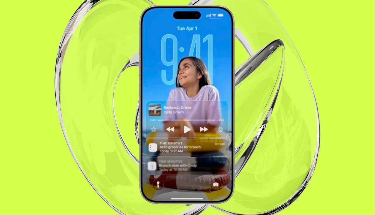
No denying this: Apple’s Liquid Glass is hot.
It’s modern. It’s premium. It feels like your interface is bathed in baby oil and dipped in Swarovski crystal.
It blurs, it reflects, it glows — like your screen just walked out of a sauna. It makes regular UI feel like it’s made of cardboard and regret.
Your weather widget? Now a glassy masterpiece.
Your settings page? An art installation.
Your battery dying at 3 PM? Still annoying, but now with elegance.
🙃 But Then… the Not-So-Pretty Part
Let’s talk usability. Or should I say, the tragic disappearance of it.
🔦 Accessibility? What’s That?
You know how we used to care about contrast ratios, legibility, and actual human eyes? Yeah, apparently that’s so 2023. With Liquid Glass, everything now lives behind a foggy pane of visual mystery.
White-on-blur-on-light-gray is the new cool.
Want to read your reminders? Just squint harder.
Is that a button or a ghost? Who knows. Tap and pray.
🧓 Not So Friendly for Grandma
For folks with vision impairments, aging eyes, or simply a normal desire to see things clearly, this is a bit of a UX horror movie. It’s the kind of design that whispers, “We care more about vibes than you.”
And let’s not even talk about using your phone outdoors. That glossy light dance on the screen? Pure sunlit chaos.
🧐 Who Is It Really For?
Let’s be honest: Liquid Glass wasn’t designed for users.
It was designed for screenshots. For Apple event applause breaks. For that moment when you swipe and think, “Wow, that’s shiny.” Then immediately get lost in your Control Center because you can’t find the toggle.
It’s design as spectacle. UI as a runway model — stunning at a glance, a bit impractical up close.
🙃 So... Are We Just Jealous?
Maybe a little.
Because as designers, we’ve spent years fighting for clarity, readability, inclusivity.
Now here comes Apple, slapping a shiny blur filter on everything and calling it revolutionary.
And what do users do?
They swoon. They upgrade. They post unboxings in cinematic slow-mo.
So maybe we’re not mad. Maybe we’re just... tired.
🤓 Final Thoughts
Liquid Glass is a visual flex, no doubt.
It’s ambitious, immersive, and makes Android look like it’s stuck in a 2016 Bootstrap demo.
But as always, the question remains:
Is beauty enough when function takes a back seat in a foggy, reflective Tesla?
Your move, Cupertino
Stay blurry, stay bold.
✍️ Design Disrupted